Nagoya City University and HTWK Leipzig
19 - 25 September 2010

Reset: The anatomy of Creative Quarters
With the “Raise of the creative class” Richard Florida detects the rise of a new social class - including scientists, engineers, architects, educators, writers, artists, entertainers, etc. - whose economic function is to create new ideas, new technology, and new creative content. This group shares common characteristics, such as creativity, individuality, diversity, and merit and profoundly influences work and lifestyle issues.
Since then we have witnessed Creative Quarters developing at a fast pace globally, in urban and suburban conditions. For the sake of preservation, real estate development or business this phenomenon is responsible for community inception, while influencing cultural phenomenon and impacting business.
Creativity is good asset for a city’s image, and meanwhile it has developed into a meaningful economic factor. In Berlin, for example, the “creative class” accounts for 21% of the city’s gross domestic product. This means that over one tenth of Berlin’s working population is involved in the creative economy. The “neighbourhoods of change and new beginnings” are now catching up, both in the east as well as the “old west”.
The September workshop at ANCB, Reset, aims to understand in a comparative manner the upsides of this phenomena and to unravel the complexity behind the success of such quarters.While focussing on a case study, the students will distill the key factors that underpin success for such communities and will explore, by developing tools and systemic strategies, the interrelation of vision and what is locally given.
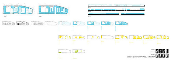
Group1: substation
by Nana Okawa, Naoyuki Sugimoto, Alison McNicol

The workshop studio task involved the development of the Revaler Ecke site, a former train repair and maintenance facility abandoned soon after reunification and occupied until the early 90's predominantly by squatter communities. The seven acre complex is currently home to one of Berlin's most dynamic creative quarters, thus our approach toward an architectural intervention evolved as a combined response to the innate sensibility of the present occupants and the relics of a collapsed industrial era. Substation is inspired by the idea of a cultural urban control centre, and the traces that mark the passing of time in a permanent state of transience.
The building seeks to connect the surrounding urban fabric with that contained inside the existing walls by following the perimeter structure, integrating the pattern of new and old as a single architectural gesture. A proposal to maintain only the exterior shell of the original buildings revealed a framework in which to guide new interventions, thus establishing a method of design that informed the interrelation of structures. Consideration was payed especially to creating new tensions and flexible variations between the types of spaces the development should provide in support and encouragement of a successful creative quarter.
by Luise Albrecht, Yuma Ishizuka, Koharu Yokoyama, Yuki Takeuchi

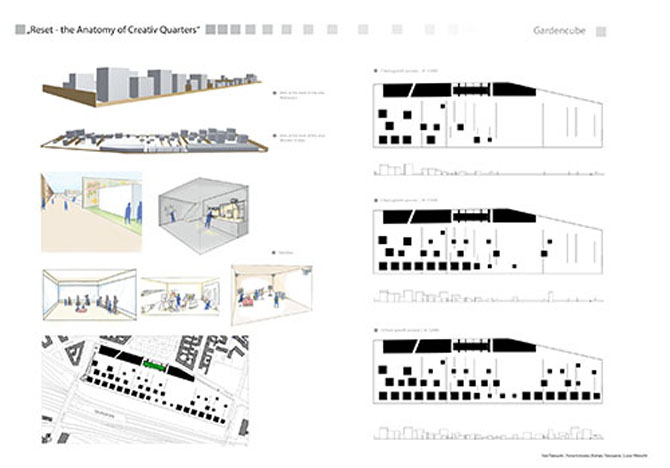
We thought that this area has a lot of potential as it is a part of Berlin’s subculture. We wanted to leave the graffiti, so we decided to leave the southern, northern, and around walls. People who are walking in the main street would have the same view same as before. But you have another view if you turn around the corner.
Inside the enclosing walls, there are cubes. There are several functions envisaged for the space between these walls. For instance, the wide area could be a space for events and the narrow area a work space for architecture. Some of the cubes pierce through the wall to connect this area with the next one. Inside this box, there could be functions the users on both sides could use. For instance, there could be a print shop between an architect and designer. Some small cubes are made of glass. These cubes would be shops, gallery, classrooms, and so on. Thus, all small cubes are on this side. All the big cubes are inside the walls and intended as residence and office.
The building along the road are big cubes for connecting the outside and the inside. There are some slits, so people walking the street can look inside the wall. And one old building remains, covered by glass. So this building advertises the inside cubes.
Ten years later, some cubes will grow up like plants, thus people walking in main street can see some growing taller cubes.
by Grit Bredemann, Kazuhito Kondo, Haruhi Shiozawa, Sayumi Matsuhiro

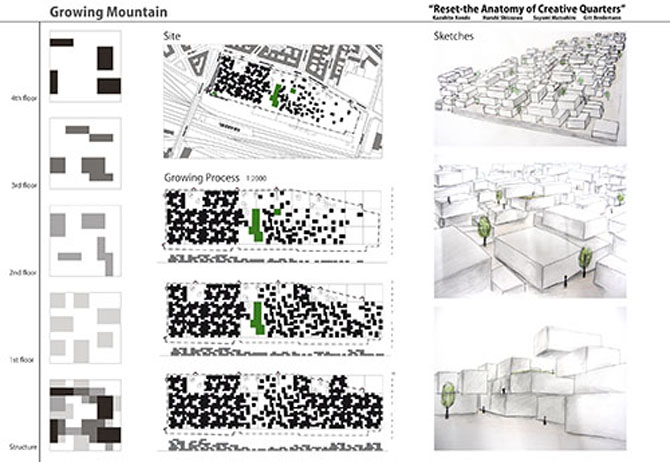
On site, there are streets and buildings that are too big for people to use, because the site used to be a train factory. These buildings are broken and old and thus dangerous to use. But there are many young people who need places to do something creative.
We decided to divide the site into small pieces and to create many different kinds of places.
We kept some of the old buildings. We designed three types of small boxes and stacked them. These boxes could be used as offices, for housing, as ateliers and so on. One unit of stacked boxes has four floors and a courtyard. The stacked boxes are shiftable, so many kinds of places can emerge.
We placed the units to look like a mountain. On one side of the site, there would be the four storey units and on the other side the one story ones. In the centre of the site, the units which have 2 or 3 floors would be located.
After 2, 5, and 10 years, old buildings will disappear if they are not needed. And then, new units or boxes will appear. They could be stacked on the units which have 1, 2, or 3 floors, thus creating a mountain with a changing shape.

