Aedes in cooperation with Zumtobel is pleased to host the exhibition KAZUYO SEJIMA + RYUE NISHIZAWA, SANAA/Tokyo.
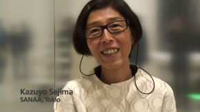
This exhibition features the Pritzker Prize award winning Japanese architects Kazuyo Sejima and Ryue Nishizawa of SANAA, located in Tokyo. Kazuyo Sejima, who has also been the Director of the 12th International Architecture Biennale in Venice this year, together with Ryue Nishizawa, follow in their projects common ideas. One is the transition between interior and exterior space. Their architecture is often characterized by a transparency that questions boundaries between interior and exterior. Another one is the building program, the result of a diagrammatic architecture, for which they have gained international recognition.
One large work by the Italian artist Walter Niedermayr from Bolzano will be shown in the exhibition. Niedermayr's artwork produces a new perspective on SANAA’s buildings and stimulates the ongoing artistic dialogue between them.
The exhibition gives an insight to SANAA’s work, the subtle interplay of light and materials and the relation between the organization of the program, the way people use it, and the materialization; the architectural form.
Aedes has already presented this extraordinary office with the exhibition ”SANAA – recent projects” ten years ago in Berlin. Now, this winter, the following projects will be on display:
Rolex Learning Center, EPFL (Ecole Polytechnique Federale de Lausanne), Switzerland: SANAA’s most recent building in Europe, an extension to the Technical Faculty, École Polytechnique Fédérale de Lausanne. The Learning Center is a multi-program facility housing a library, language center, offices, café, restaurant, and hall. Located centrally on the site, people can gather with ease in this one-room space. The roof and floor undulate gently with patios of different sizes and shapes located throughout. The main entrance can be approached from all four sides by walking under the slab. Visitors then stroll up the gentle curves, or walk past the patios to access various aspects of the program. From the slightly elevated areas, visitors can enjoy views of the existing campus, Lake Léman, and the Alps. Changes in height, as well as large and small patios create many different atmospheres. During large events, the multipurpose hall seating can be extended up the slope, one can quietly read a book from the library on a hill with a nice view, or drink coffee in a large patio. They aimed to create a place where activities are gently separated but at the same time naturally blending into one another to create a unified space.
Louvre-Lens, France: By breaking up the volume into smaller pieces, the office avoided blocking the site and reduced the scale of this large program. The size and the curving has been adopted from the dimension and arrangement an old railway system that remained on the periphery of the site. A central volume of glass introduces a void in between the building volumes thus further opening up the site, visually and physically. This delicate glass box serves as a foyer and a large public space in the city. It is visually transparent, opens up to multiple directions, and is possible to cross without being a museum visitor. SANAA considered rectilinear volumes too stark to comply with the idea of extreme affinity to this site and unleashed free form can be oppressive to museum interiors. Therefore considering the scale of the long stretched curvature of the site, very calm curves were proposed. These curves twist the volume along the nature, gently distort the interior experience, and carefully interact with the art. To fuse nature and building, a highly reflective polished and anodized aluminum façade clad the volumes, rendering blurred reflections of the surroundings, changing with the scenery, the weather and the position of the visitor. The circulation system is at parts falling out of the building volumes, and visitors are finding themselves in glass tunnels snaking through the field, wandering in a place between nature and its reflected imagery - in between real and unreal.
HyundaiCard Concert Hall, Korea: Located in Seoul on a hilly site with a vertical interval of approximately 15m, this complex building has a program consisting of concert hall, restaurants, a café and bookshop. The layered floors undulate gently and are open to the city. The entrance hall and foyer are located on the first floor, café and bookshop on the second, and restaurant with an entire view of the old city on the top floor. Although the lower core of the building contains the acoustically designed main music hall the open nature of the building enables upper levels to indulge in multipurpose spaces. It is an architecture in which the entire space can become one large music hall.
Serpentine Gallery Pavilion 2009, Great Britain: The Pavilion is made of floating aluminum, drifting freely between the trees like smoke. The reflective canopy undulates across the site, expanding the park and sky. Its appearance changes according to the weather, allowing it to melt into the surroundings. It works as a field of activity with no walls, allowing views to extend uninterrupted across the park and encouraging access from all sides. The organic shape of the pavilion creates areas of varying character. The line of the roof is drawn around an event space, cafe, music area and rest space. It is a sheltered extension of the park where people can read, relax, and enjoy summer days. The 26 mm aluminum roof rests lightly on the columns, 50 mm in diameter, distributed randomly through the park. Curved acrylic partitions provide transparent shelter, creating comfortable environments for evening events and gently distorting the view of the park.
Torre Neruda, Mexico: The project is a 25-story office building and serves companies with rentable office floors ranging from 1000 to 500 square meters. The three smallest floor plates at the top are reserved for one-floor residential units, a private club and/or special offices. There are one-meter setbacks on different sides as the building rises. This creates four unique facades animated by terraces at every floor. As the relationship between core, envelope, and terrace changes, so too does the character of the office space. On a cloudy day, the building is a monolithic shape such that the small setbacks fold into a whole shape, appearing like a mountain in the distance. In the sun, the light reflects off of the setbacks bringing depth to the volume. The simple steel structure follows the shape of the building. The columns jump on each floor according to the system of setbacks. At the ground level the structure on the four facades begins with a 3 m pitch that wraps the building shifting to a 2 m pitch at the corner of the first set back then loosing one column creating a four meter pitch at the second shift. The ground floor has a bank, a restaurant, and a café. This leaves approximately two thirds of the site for green areas.
Inujima Art-House Project, Japan: Inujima is a tiny island in the Seto Inland Sea, home to 50 families. The Art-House project is about turning this depopulated hamlet into a “museum” by renovating existing houses and adding new structures to be used as exhibition spaces. The island is covered with gentle slopes full of rich natural vegetation. Each Art-House and the exhibited art has been designed to blend in with its surrounding, sometimes with old wooden structures being reused while others are newly constructed using acrylic, aluminum, or local stone. But when the Art-Houses are viewed collectively, a new landscape emerges. Four models of this project will be shown in the exhibition.
Teshima Art Museum, Japan: is located on Teshima Island in the Seto Inland Sea. It faces the ocean from a magnificent hillside covered by rice terraces. The architectural design was composed of free curves, echoing the shape of a water drop. The idea was that the curved drop–like form would create a powerful architectural space in harmony with the undulating landforms around it. A thin concrete shell slab reaches as high as sixty meters, creating a large, organic interior space. By making the ceiling lower than that of many shell structures, the architecture appears to be part of the external landscape, like a hill or a slope. Inside, it has a space that stretches low and horizontal. There are large apertures on the surface of the shell to let in light, rain, and fresh air. The architecture aims to create a dynamic space that is both closed for the work of art and the environment and open at the same time. The goal is to generate a fusion of the environment, art, and architecture that also work together as a single entity.
Garden and House, Japan: This is a home office planned in a highly condensed area near Tokyo Station. The residents are two women in the editorial business who wish to work and live in this historical environment. The impression was that it involved a program that is halfway between different usages like an office, a residence or a dormitory. The site is an extremely small rectangle of 8×4 m. Around are gigantic buildings over 30 m high standing with no set back: the site was virtually at the bottom of a valley. Suspecting that a building with regular frame walls would narrow the interior space as the frame thickness is subtracted from the site’s already narrow width, a possibility to create a building with no walls had to be found. The final choice of structure consisted of a vertical layer of horizontal slabs, with each floor level having no walls. A garden and a room come in pair as they are distributed on each floor. Every room, whether living room, private room, or bathroom, has a garden of its own, so that the residents may go outside to feel the breeze and enjoy an open environment in daily life. The entirety is a wall less, transparent building, designed to provide an environment with maximum sunlight despite the dark site conditions and the best comfort and delight in life in this exceptional location in the heart of Tokyo.
Catalogue
An Aedes catalogue was published.
With a text by Dr. Harald Sommerer
ISBN 978-3-937093-15-4
English
Price € 10,-

Sponsors
Zumtobel, ArcelorMittal, Busch-Jaeger, carpetconcept, AXOR Hansgrohe, Japan Foundation


